



The Importance of UX/UI in a Website
When a visitor lands on a website, they do not read everything straight away. They look at the interface, scan the headings, judge the clarity of the design, search for the right information and assess within seconds whether the company feels trustworthy. A professional website should therefore not only look good. It must offer a clear user experience, intuitive navigation, a logical content architecture and a journey that is easy to understand, on both desktop and mobile.
That is the whole point of UX/UI: creating an interface that is pleasant, consistent and effective, while also designing a journey around the user’s real needs. UX helps reduce friction, structure the key steps and improve conversion. UI makes the user interface more readable, reassuring and engaging. Together, they turn a simple digital platform into a true tool for trust, understanding and measurable performance.
Key takeaways
-
UX/UI is not just about creating a beautiful design, but about building a clear, smooth and reassuring experience.
-
UX organizes the user journey, while UI guides the eye through the interface.
-
A strong experience can improve trust, user engagement and the conversion rate.
-
Mobile, accessibility, loading speed and SEO are also part of strong UX/UI work.
-
In short: an effective website does not only aim to please. It helps users understand, decide and act.
1. UX and UI: two different but complementary concepts
UX and UI are often associated with each other, and sometimes confused. Yet they do not refer to exactly the same thing. UX, or user experience, refers to the overall experience users have when they interact with a website, an application or a digital product. UI, or user interface, refers to what users actually see, handle and use on screen.
The distinction matters, because a website can look good without being easy to use. Conversely, a website can be functional but lack emotion, personality or visual consistency. The right balance therefore consists in creating an attractive interface that is also intuitive, useful and designed around visitors’ real needs.
UX thinks about the journey before the appearance
UX focuses on the way users experience their interaction with the website: can they quickly find the information they need? Do they understand the offer? Do they know which action to take? Can they move easily from one page to another? This thinking begins before the mockup, with an understanding of needs, barriers, expectations and the user journey. Good UX design is therefore not just about organizing blocks: it builds a logical, smooth and user-centered journey.
UI makes the experience visible and engaging
UI covers colors, typography, buttons, menus, forms, spacing, icons, animations and every visual element of the interface. It gives shape to the experience. Its role is not only to make the website visually appealing, but also to guide the eye, make actions obvious and strengthen brand consistency. Strong interface design creates a smoother reading experience and a more intuitive journey.
UX without UI, UI without UX: two common mistakes
Good UX without polished UI can result in a website that is clear, but too cold or not very memorable. Beautiful UI without UX thinking can create a website that is appealing, but frustrating to use. One does not replace the other. Effective web design comes from their combination: a structure designed for use, supported by a consistent, attractive and easy-to-understand interface.

2. A website’s first impression happens very quickly
A visitor does not always give a website a second chance. If they land on a page that feels confusing, slow or not very reassuring, they may leave before they have even understood the offer. This reaction is not always conscious. It comes from an overall feeling: does the website seem professional, clear, stable and credible?
This first impression plays a crucial role in trust. It influences how users perceive the company, its seriousness and its ability to meet their needs. In a digital landscape where everyone compares quickly, a poorly structured website can cost dearly in attention, credibility and opportunities.
Design sends an immediate signal of professionalism
The header, colors, visuals, spacing, heading readability and quality of the layout all send an initial signal. A harmonious, clear and consistent website reassures users before they have even read all the text. Conversely, a disorganized interface can create doubt: if the online experience is confusing, will the service be confusing too? Visual design therefore directly shapes the perception of professionalism.
Clarity matters more than spectacle
A website does not need to impress at all costs. It must first help visitors understand where they are, what the company offers, who it is for and what they can do next. An original animation, a large image or an interactive effect can be useful, but only if it serves the message. Design focuses on clarity, hierarchy and intention, not aesthetics alone.
A confusing interface creates friction
Friction appears when users have to think more than necessary. A menu that is too dense, a button that is hard to see, a page that is too busy, a poorly explained form or impractical mobile navigation can slow down the journey. These details can increase the bounce rate and reduce engagement. Users do not always leave because they are not interested; sometimes they leave because the website does not help them enough.

3. Good UX helps users find the right information
Most visitors arrive on a website with an intention. They want to understand an offer, compare providers, verify expertise, find a price, view projects, get in touch or simply feel reassured. A good user experience anticipates these intentions in order to provide the right content at the right time.
An effective website does not force users to search for long. It organizes information in a logical, progressive and accessible way. The clearer the journey, the more confidently users can move forward, without feeling that they have to guess how the website is structured.
Understand the audience before building the journey
A website aimed at SME managers is not designed in the same way as a website aimed at individuals, students, a sports community or technical profiles. Expectations, vocabulary, proof points and barriers are not the same. That is why the research phase is essential: it helps identify what visitors really need before designing the site structure, content and actions.
Organize content to reduce mental effort
A good journey reduces cognitive load. Users should not have to remember too much information, search for an important page for too long or figure out the menu logic on their own. Headings should be explicit, sections clearly hierarchized, CTAs visible and pages organized according to a natural progression. This structure makes the website easier to browse and creates easy navigation in everyday use.
Adapt the experience to the website’s goal
Not all websites have the same goal. A showcase website must reassure and explain. An e-commerce website must make purchasing easier. A landing page must lead to a precise action. A recruitment website must make people want to apply. A booking platform must make appointment booking intuitive. UX therefore connects user needs with business goals.
| Type of website | Visitor need | UX/UI priority |
|---|---|---|
| Showcase website | Understand the offer | Clarity, proof points, visible contact |
| E-commerce | Buy without friction | Product pages, basket, smooth payment |
| Landing page | Decide quickly | Direct message, precise CTA |
| Recruitment | Picture themselves in the role | Culture, missions, simple application |
| Local service | Find practical information | Opening hours, access, phone, clear form |
This table shows one simple thing: experience cannot be copied from one project to another. It is built according to the context, expectations and expected action.
4. UI guides the eye and makes the website more intuitive
UI plays a very concrete role in the way content is read. It shows what matters, what is secondary, what can be clicked and what deserves attention. Without visual hierarchy, every element seems to carry the same weight, and visitors can lose the thread.
A good user interface does not simply decorate the website. It makes navigation easier, makes the content more readable, improves understanding and strengthens the consistency of the whole. It is a true trust-building lever.
Visual hierarchy makes reading easier
A strong heading attracts attention. A subtitle clarifies the idea. A well-spaced block encourages reading. A contrasting button indicates the main action. Well-chosen pictograms can support understanding. Each component has a role. The aim is not to add graphic effects, but to create a visual path that helps users understand the page effortlessly.
Buttons should encourage a clear action
An effective button must be visible, readable and precise. “Request a quote”, “Schedule a call”, “View our projects” or “Receive an audit” provide more information than “Click here” or “Learn more”. The call to action should appear at the right moment, once users have received enough information to decide. When well placed, it supports conversion without making the journey feel aggressive.
Graphic consistency strengthens the brand
Visual consistency gives an impression of control. When buttons, forms, colors, typography, cards and icons follow the same rules, users understand more quickly how to interact with the website. Design also supports branding, because it makes the brand more recognizable. This consistency improves credibility and memorability.

5. When UX and UI work together, the website performs better
A high-performing website does not rely on a single detail. It works because several elements move in the same direction: clear content, intuitive navigation, a consistent interface, controlled loading times, responsive design, visible proof points and well-placed calls to action. When all these elements reinforce each other, the experience becomes more fluid.
This fluidity has concrete value. It helps users understand faster, hesitate for less time and take action with greater confidence. This is where UX/UI moves beyond aesthetics and becomes a performance lever.
For users: more comfort, less hesitation
A positive user experience gives visitors the feeling of being guided. They know where they are, what they can do, how to go back and which step to follow next. This clarity improves user satisfaction, because the website respects their time and attention. It becomes smoother and more accessible, even for someone discovering the company for the first time.
For the company: more measurable conversions
For the company, strong UX/UI can support conversion rates, improve the quality of enquiries and reduce abandonment. A shorter form, a clearer message, a better-placed button or a more visible proof point can influence the conversion rate. Conversion therefore does not depend only on the final action. It is built throughout the journey through small, coherent decisions.
For the brand: an experience that stays in mind
A satisfied visitor does not always become a client immediately. But they may come back later, recommend your company or compare your offer more favorably. This positive impression supports retention, user satisfaction and brand loyalty. In a digital marketing strategy, UX/UI therefore contributes to the long-term relationship, not only immediate performance.
Turn your website into a useful experience
At Qreative, we design websites that do not simply look good: they must guide, reassure and make people want to move forward.
Our team works on every journey with method: content architecture, user interface, responsive design, intuitive navigation, SEO, performance and conversion-point optimization.
Each project is designed to create a smooth, readable and measurable experience, making your website easier to understand, more enjoyable to browse and more effective for your visitors.
Discover our services
6. The right UX/UI method: before, during and after design
An effective interface is not born from a mockup drawn too quickly. It is built step by step. Before design, you need to understand and organize. During design, you need to clarify and prototype. After launch, you need to test, measure and improve.
This method prevents web design from being reduced to a matter of taste. It allows for decisions that are more transparent, more rational and closer to the website’s real objectives.
Before design
Frame the objectives
The first step is to clarify the objectives. Should the website generate quote requests? Sell a service? Recruit? Explain expertise? Reassure partners? Support an SEO strategy? This step defines priorities, key messages, important actions and the indicators to track. Without framing, the design risks becoming beautiful, but poorly aligned with business needs.
Understand users
You then need to ask what visitors are really looking for. What are their questions? What barriers might hold them back? What proof points do they expect? Are they in a hurry, expert, hesitant, curious or already ready to get in touch? This thinking can draw on interviews, existing data, a website audit, sales feedback or analysis of frequent enquiries. The goal is to design with a real understanding of the audience.
Structure the content
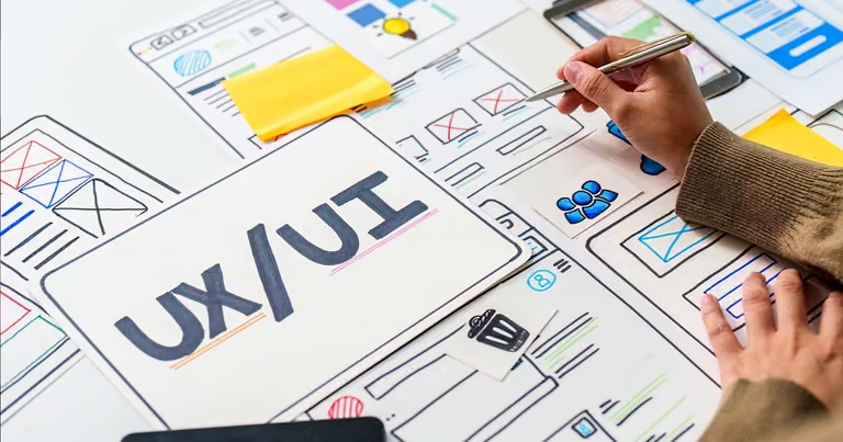
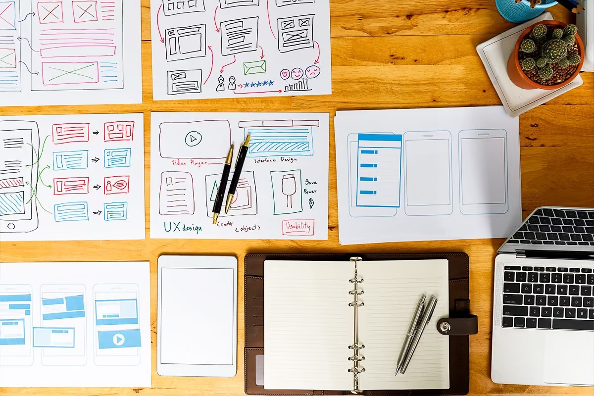
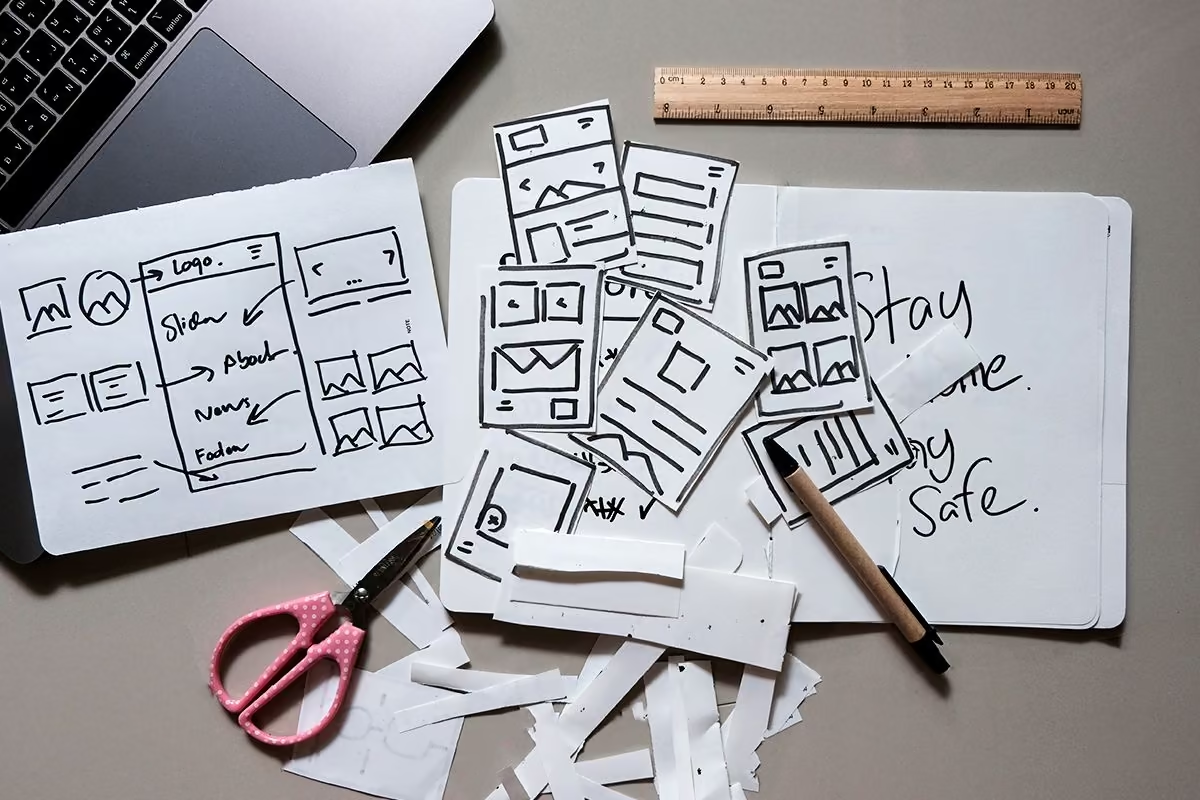
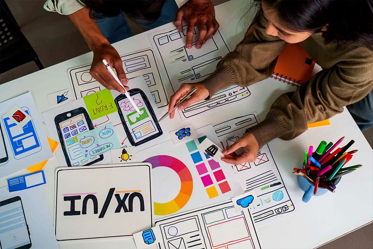
The site structure, pages, sections and CTAs must be planned before the final interface. Wireframing makes it possible to lay out this structure without being distracted by colors or visuals. This step helps check whether content is well placed, whether the journey is logical and whether each section plays a precise role. Wireframing is often one of the best ways to avoid pages that are too long or poorly structured.
During design
Turn the structure into a clear interface
The mockup brings the journey to life. This is where the layout, typography, colors, images, components and interactions take shape. But every choice must remain useful. An animation should guide. A color should create hierarchy. An image should support the message. A form should reassure. The interface should not only look modern; it should help users move forward.
Prototype and test the journeys
Prototyping makes it possible to simulate the experience before web development. You can observe how users interact with the pages, check whether navigation is clear, test buttons, identify hesitation points and make adjustments before development. This step reduces costly errors. It also improves collaboration between designer, developer, SEO copywriter and client.
After launch
Measure and improve
A website is not fixed on the day it goes live. Real data makes it possible to measure behavior: click-through rate, abandoned forms, undervisited pages, scroll depth, bounce rates, qualified enquiries or direct feedback. Usability testing and user feedback then help gradually improve the experience. The aim is not to rebuild everything, but to adjust what can improve clarity, trust and conversion.
7. UX/UI mistakes that make visitors leave
Some UX/UI mistakes are visible immediately. Others are more discreet, but just as damaging. A visitor may leave a website not because the offer is poor, but because the journey is too complicated, too long or too unclear.
The company itself does not always see these issues. It knows its offer, its vocabulary and its priorities. The visitor discovers everything from the outside. That is why you need to look at the website through their eyes, not only through the internal team’s perspective.
The most common mistakes to check
Here is a simple checklist to identify the main friction points:
-
Is the menu clear and limited to truly useful pages?
-
Are the CTAs visible, precise and placed at the right moment?
-
Are the pages spacious, or too crowded?
-
Do the forms only ask for necessary information?
-
Is the website genuinely mobile friendly?
-
Do the contrasts allow comfortable reading?
-
Are error messages easy to understand?
-
Are trust-building proof points visible?
-
Does the content answer visitors’ real questions?
-
Does navigation remain consistent across all pages?
Too much information can blur the message
Many companies want to explain everything on a single page. They add arguments, details, proof points, text, exceptions and secondary blocks. The intention is good, but if everything is given the same level of importance, visitors no longer know what to remember. Good UX work also means cutting, moving, simplifying or rephrasing. Clarity sometimes requires choices.
Forms that are too long can slow down conversion
A form is often a sensitive step. The more information it asks for, the more effort it creates. If users have to provide too many details before even speaking to the company, they may postpone their request or abandon it altogether. A better approach is to ask for the essentials first, then complete the information during the conversation. This makes the journey more human, more accessible and often more effective.
Vague CTAs slow down decisions
A vague CTA forces visitors to interpret what comes next. “Send”, “Discover” or “Learn more” can be useful, but not everywhere. On a service page, “Request a quote”, “Schedule a call” or “View our projects” is often clearer. The button should indicate a concrete action, not simply decorate the page.
8. Mobile, accessibility and performance: three pillars not to overlook
UX/UI does not only concern the desktop version of a website. A successful experience must work on desktop, tablet and smartphone. Today, mobile responsiveness is essential, because many visitors discover, compare or contact a company from their phone.
Performance and accessibility are just as important. They are not merely technical topics. They influence perceived quality, ease of navigation, reading comfort and trust.
Mobile requires a more direct experience
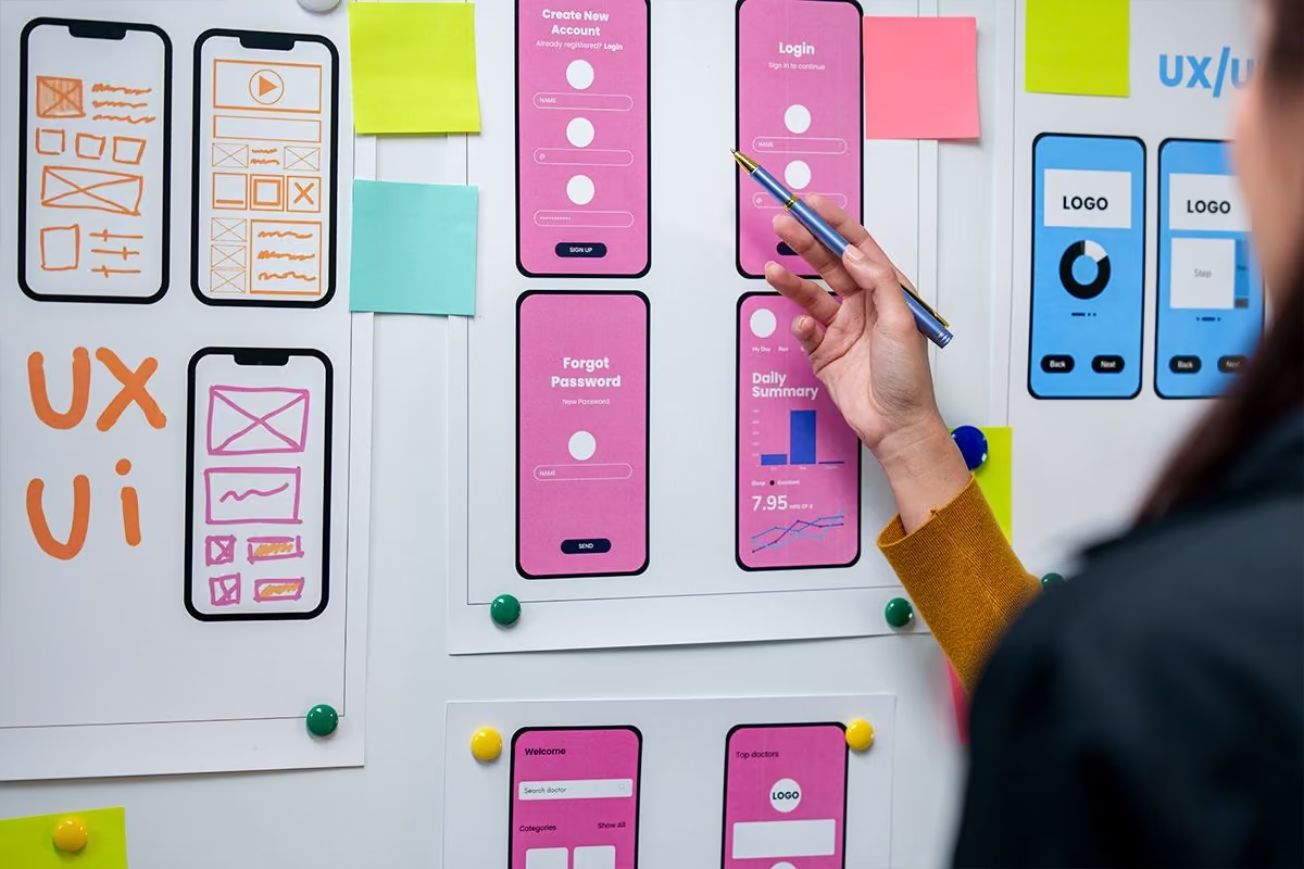
On mobile, space is limited and attention is more fragile. Buttons must be easy to tap, text must remain readable, menus must be simple and forms must get straight to the point. A page designed only for desktop can become difficult to use on a smartphone. Mobile should therefore not be a last-minute adaptation, but a central aspect of the design process.
Accessibility improves the experience for everyone
Accessibility concerns contrast, text sizes, image alternatives, heading structure, understandable links and keyboard navigation. It benefits people with disabilities, but also all users: quick reading, visual fatigue, low light, small screens, unstable connections. An accessible website is often a clearer, more robust and more professional website.
Speed influences trust
A slow website can break a good impression. If a page takes too long to load, if an element moves at the moment of clicking or if the interface responds slowly, users can lose patience. Loading time is therefore part of the experience. Optimized images, clean development, controlled animations and a lightweight structure all contribute to a smoother and more credible website.
SEO also benefits from a better experience
UX/UI and SEO are not separate topics. A clear structure, logical navigation, well-hierarchized content, a solid mobile version and strong performance help both users and search engines. A well-designed website makes exploration, understanding and engagement easier. In a search engine strategy, user experience can therefore support visibility as much as conversion.
9. Design trends: follow user behavior, not passing fads
Web design evolves quickly. Immersive animations, micro-interactions, bold typography, 3D, full-screen videos, minimalism or highly editorial interfaces: these trends can add character to a website. But they are useful only if they serve the experience.
A graphic effect should never become more important than the message. If a trend slows down the website, makes reading harder or distracts from the main action, it harms the objective.
A visual effect must have a function
An animation can guide attention. A micro-interaction can confirm that an action has been completed. A video can show an atmosphere. Bold typography can strengthen an identity. But every choice must be justified. UI is not about piling up effects. It is about choosing the right codes to make the experience clearer, more memorable and more effective.
The right design depends on the context
A medical practice, a real estate agency, a fashion brand, an industrial company, an association, a mobile application or a media outlet do not have the same needs. The level of graphic boldness, information density and visual tone must adapt to the audience. In some cases, restraint reassures. In others, an interactive experience encourages engagement.
Transparency helps make better decisions
Serious support does not consist in saying “it looks better this way”. It consists in explaining why a choice is made: why this button, this color, this structure, this form, this amount of text or this animation. This transparency turns design into a strategic discussion. It allows the client to understand the trade-offs and connect aesthetics to the expected results.
10. Conclusion: a good website must guide as much as it must please
The importance of UX/UI in a website comes down to one simple idea: a visitor is not only looking for a beautiful interface. They are looking for a clear answer, proof of trust, intuitive navigation and an easy action to take. Design must therefore support their journey, not just catch their eye.
An effective website brings together strategy, content, graphic design, ergonomics, development, mobile, accessibility, performance and measurement. It is this balance that turns a digital showcase into a true tool for communication, relationships and conversion.
At Qreative, this approach means designing websites that feel right: right for users, right for the brand image, right for the company’s goals. When visitors quickly understand your value, find what they are looking for and know what to do next, UX/UI becomes a concrete lever for trust, satisfaction and measurable performance.
FAQ
What is the difference between UX and UI?
UX, or user experience, refers to the journey a person goes through on your website: finding information, understanding an offer, navigating easily, filling in a form or taking action without friction. It therefore relates to logic, structure and ease of use.
UI, or user interface, refers to what users see and interact with: colors, buttons, typography, menus, spacing and visual elements. The two are complementary: UX makes the journey smooth, while UI makes the experience clear, consistent and pleasant.
Why is UX/UI important for a website?
UX/UI is important because it directly affects how visitors perceive your company. A clear, fast and well-structured website creates a positive first impression, builds trust and helps users quickly understand what you offer.
Conversely, confusing navigation, a hard-to-read design or a poorly placed button can create frustration. Strong UX/UI therefore improves client satisfaction, engagement, loyalty and the chances of conversion.
Is a beautiful design enough to make a website effective?
No, an attractive design is not enough if the journey is difficult to understand. A website can look visually successful, but still lose visitors if the information is poorly organized, if the actions are unclear or if users do not know where to click.
An effective website combines aesthetics, clarity and strategy. Design should help users navigate, understand the offer and take action. At Qreative, the goal is therefore not just to create a beautiful website, but a useful and measurable experience.
How can UX/UI improve the conversion rate?
UX/UI can improve the conversion rate by reducing friction throughout the journey. A clear menu, visible calls to action, a simple form and a well-thought-out content architecture help users move forward naturally.
Conversion does not depend only on the final click. It is built through a consistent experience: reassuring messages, visible proof points, intuitive navigation and an interface that builds trust at the right moment.
When should you think about UX/UI in a web project?
You need to think about UX/UI right from the start of the project, even before creating the mockups. This thinking helps clarify the objectives, understand the audience, organize the content and define the key actions to highlight.
UX/UI then continues throughout the design, development and post-launch phases. Testing, data and user feedback make it possible to identify potential improvements and evolve the website with a continuous improvement mindset.
What are the signs of poor UX/UI on a website?
Several signs can point to poor UX/UI: a menu that is too complex, overloaded pages, buttons that are hard to see, text that is difficult to read, a form that is too long or a mobile version that is impractical. These issues make the website less pleasant to use.
Another common sign is a lack of clarity. If visitors do not quickly understand what you offer, who you are speaking to or which action they should take, the experience needs to be reworked. Strong UX/UI should make the journey simple, logical and reassuring.
Why is mobile essential in UX/UI?
Mobile is essential because a large share of visitors now browse websites from their smartphones. If the text is too small, buttons are hard to tap or menus are impractical, users may leave the page quickly.
A strong mobile experience must be smooth, readable and responsive. Content should be clearly structured, actions easy to complete and navigation adapted to touch gestures. Mobile is not optional: it is a key part of the user experience.
What role does information architecture play?
Information architecture organizes content to help users find what they are looking for without effort. It defines the pages, menus, headings, sections and the way information is connected across the website.
Strong information architecture makes the website clearer and more effective. It makes navigation easier, improves understanding of the offer and also supports SEO. It is an essential step in creating a website focused on visitors’ real needs.
How do you measure the impact of UX/UI?
The impact of UX/UI can be measured through several indicators: conversion rate, bounce rate, time spent on pages, button clicks, completed forms or contact requests received. This data shows how visitors actually interact with the website.
It is also useful to analyze client feedback, frequently asked questions and the observed friction points. This approach makes it possible to improve the interface with transparency and connect design decisions to measurable results.
Why invest in UX/UI design with a digital agency?
Investing in UX/UI design with a digital agency allows you to build a website designed around your visitors and your goals. An agency brings an outside perspective, a method and expertise in content, design, SEO and web development.
With Qreative, this process is based on listening, collaboration and clear decision-making. The goal is to create a high-performing digital solution that can improve the experience, strengthen your competitive advantage and support your company’s growth.
Related articles

FAQs in 2026: why their visible SEO impact has declined, but why they remain useful for AI

What percentage of people use AI to search online?

GEO: How to Get Your Brand Mentioned by AI in 2026