Rethinking your visual identity: how can you boost your brand image?
In a world saturated with images and messages, standing out begins with a strong and coherent visual identity. It conveys the essence of a brand, tells its story, and gives it a design that is instantly recognisable. Yet many companies still underestimate the importance of this foundational work. An outdated or poorly constructed visual identity blurs the message, creates poor communication, and weakens the perceived value of the product or service.
Rethinking your visual identity also means rethinking your brand strategy as a whole: your values, positioning, personality, and the way you want to communicate your message across different channels, from your website to social media. It is in-depth work at the crossroads of marketing, design, and creative direction. This article highlights the latest trends to transform your business identity into a true promotion tool.

Key takeaways
- Rethinking your visual identity means rethinking the very definition of your brand.
- Every business should make this process a key step in its marketing strategy: an elegant logo, a defined brand guide, and a coherent image that tells a strong story.
- A successful logo emerges from the combination of a thoughtful choice, precise execution, and renewed ambition.
- A well crafted brand identity becomes a lasting signature, capable of inspiring, attracting, and reshaping how the public perceives you.
1. What is a visual identity?
Visual identity is the foundation of all communication. It expresses the uniqueness of a brand through a carefully chosen set of visual elements: logo, colour palette, typography, shapes, imagery, and layout. Each of these components reflects part of the brand’s core DNA and helps shape a coherent representation of who it is and what it stands for.
A well crafted visual identity works like a universal language. It allows the audience to recognise a brand without even reading its name. It becomes a visual signature that embeds itself in collective memory and creates a lasting emotional connection. From Nike to Apple, major brands understand that a strong logo supported by a consistent graphic universe goes far beyond aesthetics. It becomes a strategic communication tool and a pillar of marketing performance.
2. Why rethink your visual identity?
A brand image is never static. It evolves with time, trends, audiences, and ambitions. A company that grows, shifts direction, or diversifies its activities may need to rethink its visual identity to stay relevant. This process, often referred to as rebranding, aims to align the visual universe with the current reality of the organisation.
A logo or brand system can feel outdated or lack energy. The colours used may no longer convey the right values. Rethinking does not mean rejecting what exists, but refining and adapting it intelligently. A modern, coherent visual identity helps strengthen credibility, attract new clients, and position the brand more effectively against competitors.
This strategic work relies on a deep reflection: what emotions do we want to evoke? What image do we want to convey through our communication materials? How can we evolve our graphic identity without losing the value built over the years? These are essential questions to address before starting any redesign process.
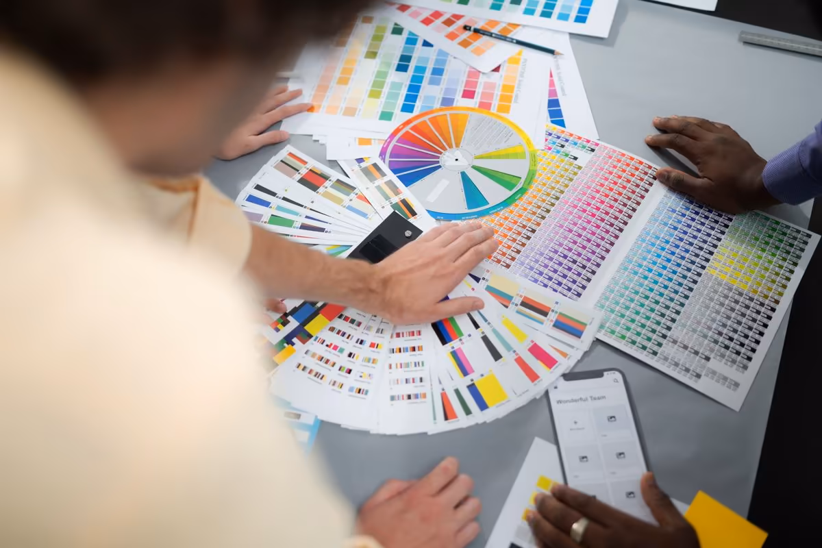
3. The essential components of a successful visual identity
A strong visual identity relies on a subtle balance between creativity and consistency. The logo is often the cornerstone. It condenses the brand’s signature into a few shapes, colours, and lines. Simple in its construction, it must be strong enough to stand the test of time.
The colour palette then plays a crucial role. It communicates emotion, tone, and energy. Blue inspires trust, red evokes passion, and green reflects nature and growth. Choosing the right shades directly influences how the public perceives the brand.
Typography, often underestimated, also conveys character. A thin, elegant typeface tells a different story than a bold or geometric one. The right graphic style creates harmony across all touchpoints: website, storefront signage, social media, packaging, or communication campaigns.
Finally, the brand guidelines bring everything together. They define layout rules, logo usage, visual construction, and tone. This reference document guides all future creations and ensures visual consistency across every interaction with the customer. It becomes essential as soon as you work with external graphic or creative partners.
4. How to create or redesign your visual identity?
Creating or redesigning a visual identity is a strategic process in its own right. Before moving into design, you need to understand the foundation rather than the surface: define your brand platform, values, mission, and audience. This framework gives meaning to every visual element.
A good starting point is to analyse your current identity and that of your known competitors. What do their logos communicate? What graphic direction are they using? Which colours dominate your sector or industry? This comparative analysis helps avoid confusion and find your own style.
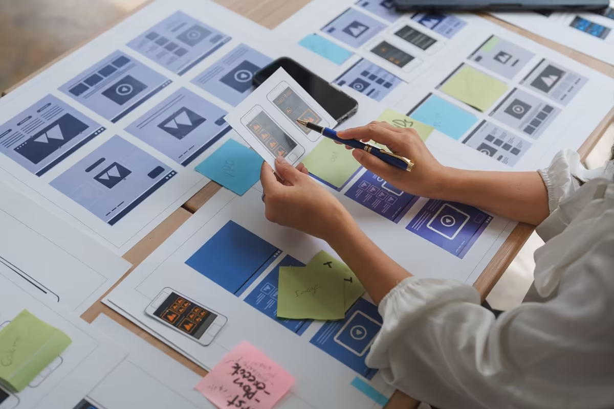
Then comes the creative phase: concept exploration, sketching, typography tests, working on colour palettes and shapes. The art director ensures cohesion between all elements so that the entire system clearly expresses the brand universe.
Once the logo is approved and the brand guidelines are finalised, the next step is to roll out the new visual identity across all touchpoints: website, signage, printed materials, social media, advertising, videos, and photography. This implementation should be progressive yet consistent, allowing the new brand image to naturally settle into the public’s mind.
5. The importance of consistency across all channels
A visual identity truly comes to life only when it is expressed smoothly and consistently. Whether it’s a website, an email campaign, a social media post, or a printed brochure, every graphic element must follow the same logic.
Consistency builds trust. When a customer encounters the same visual cues, colours, and typography everywhere, they immediately understand they are interacting with a structured, professional, and confident brand. Conversely, inconsistent visual communication creates confusion and weakens credibility.
This consistency also applies to the brand’s voice. Tone, vocabulary, and values must align with the design. A modern, minimalistic visual identity cannot be paired with overly heavy or outdated messaging. Everything must be designed as a complete ecosystem, from the logo to page layouts, including digital and physical materials.
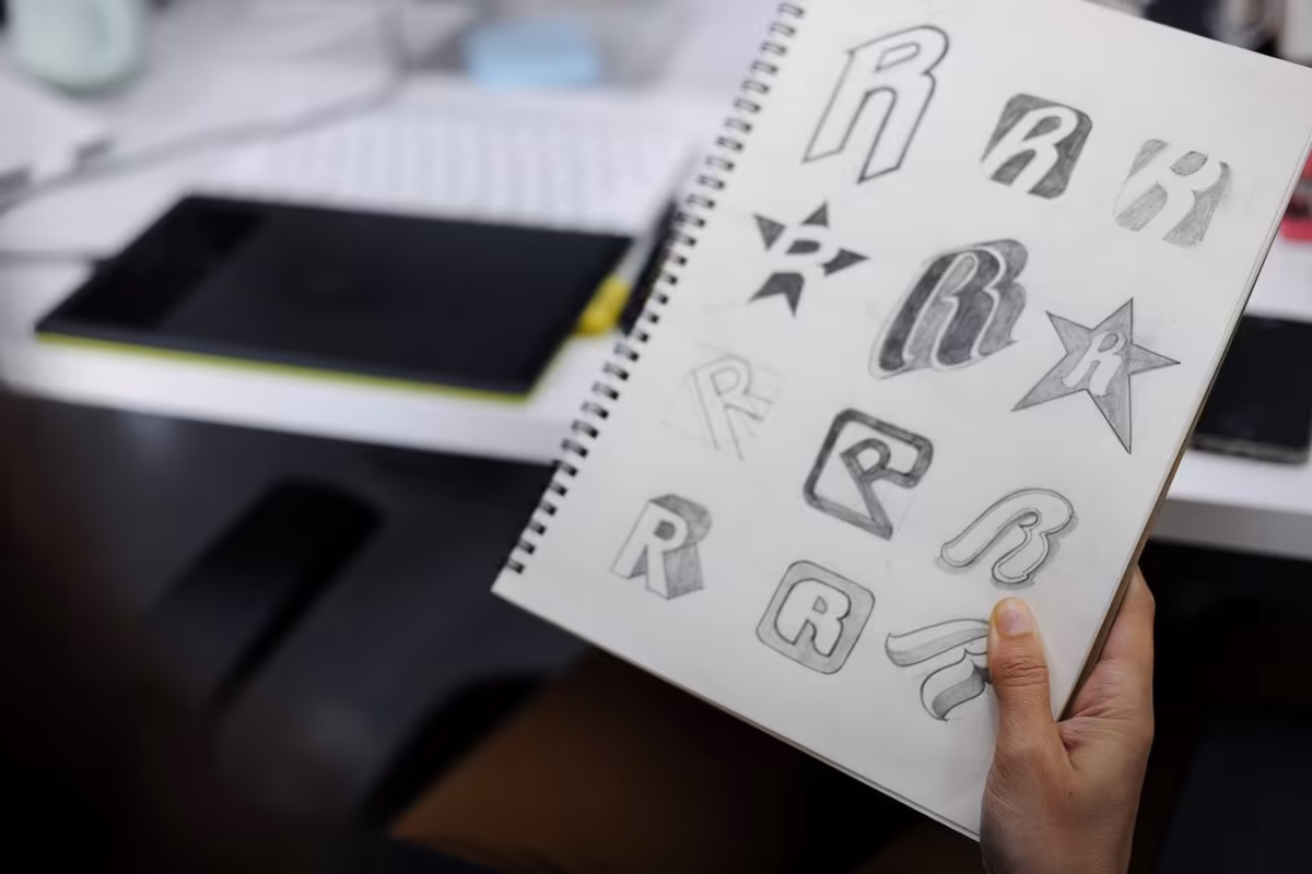
6. The logo, a reflection of the brand’s DNA
The logo is arguably the strongest symbol of any visual identity. It condenses the brand’s promise, values, and vision into a single mark. Behind its apparent simplicity lies a deep and thoughtful process.
A good logo is timeless. It adapts to all formats, remains readable on a web page as well as on signage, and keeps its impact in both colour and black and white. It must be recognisable, original, and meaningful.
Protecting your logo and your brand is a crucial step: copyright registration, filing with the INPI or EUIPO depending on your legal structure. This ensures your exclusivity and protects the longevity of your brand image.
Some logos have become true icons: Nike’s swoosh, Apple’s apple, Mastercard’s interlocking circles. Their success stems from elegant simplicity and a perfect alignment between form, colour, and brand values.
Bring your brand to life
Qreative is more than a design agency. We craft powerful identities and memorable logos that elevate your brand. From creative strategy to graphic execution, we give meaning to every colour, shape, and word to tell your story with coherence.
Our team supports you with a tailored, transparent, and results driven approach, turning your identity into a true engine for growth.
7. Finding the right graphic and emotional balance
A visual identity is not just about harmonious composition. It must convey emotion and energy. The design should captivate without distracting, and every element must support the overall message.
Finding this balance requires true observation and creative work: choosing a colour palette that evokes the right feelings, a typography that reflects the brand’s character, and a layout that enhances readability.
A strong visual identity emerges from the ability to combine precision and inspiration. This is where the work of a creative team becomes essential: designers, copywriters, photographers, and web developers all contribute to shaping a coherent and lasting graphic universe.
8. Mistakes to avoid
Certain mistakes can undermine even the best efforts:
- multiplying fonts or colours with no coherence
- copying competitors’ graphic codes
- overlooking logo readability in smaller formats
- forgetting visual consistency across different channels
- or wanting to change everything without considering the brand’s history
A visual identity should evolve, not reject itself. The goal is not to chase the latest trend but to build a stable and recognisable graphic direction. The strongest brands are those that manage to evolve without losing their essence.
9. How much time and budget should you plan for?
Creating or rethinking a visual identity requires time, methodology, and a true strategic approach. Every step matters, from defining the target audience to designing the logo and producing the full set of brand guidelines.
On average, a business aiming to build a coherent visual identity should expect 6 to 10 weeks. This timeframe includes analysis, graphic exploration, client feedback rounds, and the final validation of all elements: logo, typography, colour palette, icons, photography, and communication materials.
As for the budget, it depends on the size of the organisation, its market, and the ambition of the project.
- For a small business or a local shop, a complete visual identity (logo, brand guidelines, layout rules, web and print adaptations) generally starts around €2,000.
- For a well established brand or a company undergoing a repositioning, the creation or redesign may range from €8,000 to €10,000, depending on the complexity of the materials and the marketing strategy involved.
This work is not a cost but a long term investment. A well crafted identity amplifies every marketing action, supports product sales, and strengthens brand value. The essential precautions include choosing the right creative partners, validating all formal documents, and protecting your logo and intellectual property.
A successful visual identity then becomes a strong signature, a growth tool, and a real trust driver for your audience.
10. Checklist before launching your new visual identity
Before unveiling your new visual identity, make sure every element is ready. This checklist helps you ensure a complete and accurate representation of your brand and guarantees consistent application across all materials:
- Whether it’s a logo redesign or a full creation, is your logo readable and recognisable on all media (print, web, social)?
- Do your colour codes reflect your values and positioning?
- Do your typography choices and writing style convey the character and elegance of your brand identity?
- Do your visual elements (photos, icons, illustrations) work well together?
- Does your brand guidelines document clearly define usage rules, logo dimensions, colour codes, headings, and layout?
- Do your websites, printed materials, social channels, and physical spaces follow the same graphic direction?
- Have you planned the promotion and visual communication of the new identity with a clear message for the launch?
A strong visual identity is a collective achievement. Designers, communicators, leaders, and partners all contribute to building a complete project. When properly prepared, it enables you to create an effective logo, reinforce your brand’s strength, and sustainably anchor your success.

11. Conclusion
Rethinking your visual identity is an act of transformation. It means being willing to see yourself differently, to question your values, your mission, and your position in the market. It also means recognising that visuals are not surface-level details but a major strategic lever for any business.
A well crafted visual identity strengthens your communication, supports your brand image, and builds trust. It becomes a growth tool aligned with your marketing strategy.
By redefining your colours, your logo, your materials, and your brand guidelines, you are not simply changing your appearance. You are reshaping how the world perceives your brand. And in a landscape where attention is won in seconds, this visual coherence may well be your most powerful competitive advantage.
Why is rethinking your visual identity essential for a company?
Rethinking your visual identity ensures that your brand image remains true to your company’s reality. Over time, values, products, and audience expectations evolve. A visual identity or logo that no longer reflects your positioning can blur your message and hinder communication.
At Qreative, we see this evolution as a strategic opportunity: to modernize your design, strengthen consistency across your materials, and affirm your brand personality—all through a human, clear, and measurable approach.
What budget should you plan for a complete visual identity?
The cost depends on the project’s scope and level of customization. On average, a small business can expect to invest between €2,000 and €4,000 for a complete creation (logo, brand guidelines, and web and print adaptations).
For a growing brand or a full rebranding, the budget typically ranges from €6,000 to €10,000. At Qreative, we tailor our offers to your needs, maintaining full transparency on pricing and deliverables. The goal: to invest in a lasting visual identity that supports your growth and strengthens your credibility.
What are the signs that it’s time to refresh your visual identity?
An outdated logo, hard-to-read typography, a tired color palette, or inconsistent communication materials are often the first warning signs. Your visual identity should evolve in step with your business and the market.
At Qreative, every redesign begins with a comprehensive visual audit: assessing the existing design, analyzing competitors, and understanding your audience’s expectations. This sets a solid foundation for a lasting visual identity.
What’s the difference between a logo and a complete visual identity?
A logo is a symbol, but a visual identity is a language. It encompasses the color palette, typography, layout, shapes, and imagery that express your brand’s personality. This graphic harmony is what ensures your company’s recognition and credibility.
At Qreative, we design complete visual worlds. Every visual element, from the logo to the finalized brand guidelines, reflects your story with elegance and precision.
How long does it take to create a visual identity?
Creating a complete visual identity generally takes between 6 and 10 weeks, depending on the project’s scope and the pace of collaboration. This timeline includes market research, graphic design, client feedback, and final adjustments.
At Qreative, every stage is collaborative. We adapt to your schedule to ensure a result that’s both creative and well-structured. Our goal is to deliver a strong visual identity, ready to be deployed across all your communication materials.
How can you ensure consistency across all communication materials?
Visual consistency relies on a clear brand guide and a well-defined set of rules. It specifies how to use the logo, colors, and typography across every medium (website, social media, printed materials, and business presentations).
At Qreative, we create precise brand guidelines and straightforward visual manuals that are easy to apply. This ensures your team and partners maintain perfect graphic cohesion in every communication, reinforcing a strong and professional image.
What mistakes should you avoid when creating or redesigning your visual identity?
The most common mistake is confusing modernization with rupture. A visual identity shouldn’t deny its past but reinterpret it. Another pitfall is trying to do too much—using too many colors, too many fonts, or creating a cluttered visual system.
At Qreative, we prioritize consistency, clarity, and longevity. Our process follows clear steps, with ongoing support and attentive listening to preserve your brand’s strength while giving it new life.
How can you create a logo that truly stands out?
A great logo should be simple, legible, and meaningful. It must convey your values and be instantly recognizable across all platforms. The Nike logo is a perfect example of this success: minimalist, universal, and timeless.
At Qreative, we focus on strategy before design. An effective logo stems from a deep understanding of the brand’s personality, the emotions it should evoke, and its visual differentiation within the market. True elegance in a logo lies in its precision.
How can you combine emotion and strategy in a visual identity?
A visual identity should engage as much as it organizes. Design is not just about aesthetics—it’s about creating an emotional connection with your audience. The color palette, typography, and graphic tone all play a key role in building that bond.
At Qreative, we craft identities that speak to both heart and mind. Every visual element is designed to strengthen your message, amplify your values, and shape how your brand is perceived over the long term.
Why entrust your visual identity to Qreative?
Because we believe a strong visual identity goes far beyond a logo. It embodies your company’s vision, values, and strategy. At Qreative, every creation is the result of close collaboration, built on a deep understanding of your real needs.
Our approach is founded on three pillars: proximity, transparency, and measurable results. Together, we turn your visual identity into a growth driver, a visual signature that inspires trust, attracts new clients, and strengthens your brand image over the long term.
How can you create a distinctive and memorable logo to strengthen your brand identity?
A distinctive and memorable logo is never a matter of chance. It’s the first element that expresses the strength and personality of your brand identity. Logo creation involves several design stages: reflecting on the brand name, exploring visual directions, combining shapes and colors, and developing variations for every medium, from your website to your mobile app.
At Qreative, we believe a great logo should be both unique and meaningful. It’s about using the right visual cues to set your brand apart while maintaining a natural sense of elegance. Every project follows a structured creative process, inspired by iconic successes like the timeless Nike logo, a symbol that’s simple, powerful, and instantly recognizable.
How can you showcase your visual identity across social media and digital platforms?
It’s well known that social media is now the natural extension of your visual identity. Every photo, headline, or video should convey a positive impression that aligns with your overall communication. Adapting your visual identity to social platforms helps enhance brand perception, strengthen awareness, and boost the visibility of your products or services.
At Qreative, we focus on consistent visual application across every channel: website, store, newsletter, and even your sonic identity. The goal is to build a seamless digital ecosystem where every word, image, and interaction reflects a strong, modern, and distinctive identity. That’s what allows your business or organization to stand out over time.
How can a small business or local brand differentiate its visual identity?
For a small business or local brand, standing out doesn’t require a huge budget—it mainly calls for a well-thought-out visual strategy. The goal is to differentiate your identity through a clear logo, refined design, and structured creative steps. Every graphic element, from color choices to typography, should convey your company’s values and reflect a distinct sense of elegance.
At Qreative, we tailor each project to your means and context. Our designers focus on using the right tools and adapting every communication touchpoint from storefront signage to websites, brochures, and social media visuals. The key is to deliver a consistent and positive impression at every interaction with your audience.
Why does the logo remain one of the most powerful elements in marketing?
People often see a logo as just a symbol, but it’s actually the visual engine of any brand identity. Designing one requires a thoughtful blend of shapes, words, and values, which is what gives it such strong marketing power. Whether it’s a new creation or a redesign, a logo must be clear, balanced, and adaptable across every format, from packaging to a browser tab.
At Qreative, we guide our clients through every stage of the process, from the initial brief to final delivery. We study well-known brand examples to understand what makes a logo work and how to stand out with elegance. The goal is simple: to craft an elegant, strong, and memorable logo that naturally promotes your brand and leaves a lasting impression.
Related articles

Creating an Editorial Calendar: The Key to Organized and Effective Communication

Grants for websites in 2026: available aids and funding in Belgium
How to Perfect Your Copywriting: A Practical Guide to Writing That Converts